
Leading Designs for Azure’s First Agentic Cloud Operation Platform
Aggregating 20+ solutions, enhancing operational efficiency, compliance, and optimizing cost and security to meet the evolving demands of global enterprises.
📈 Projecting $200M+ revenue gain | 📌 November 2025 Microsoft Ignite tier 1 announcement with keynote mention by Microsoft CEO Satya
My role
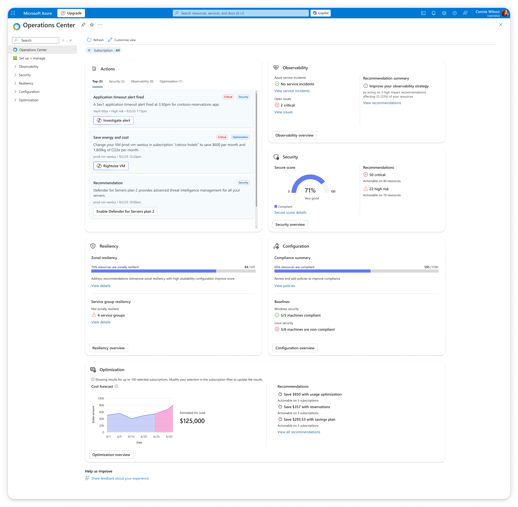
Design lead for tier 1 landing dashboard integrating data from over 20 tools. Collaborated closely with 5 product teams and 10+ designers on defining coherent design patterns across five additional tier 2 data summary pages.
Problems to tackle:
Customers struggle to modernize their operations and prevent outages due to a fragmented operation and management ecosystem and manual repetitive tasks that exhaust operator bandwidth.
Disconnected experiences make it harder to position our solutions cohesively and upsell/cross-sell solutions.
Key product objectives:
Reduce IT operation management fragmentation
Automate and troubleshoot with Copilot and agentic experiences
Enable cross-sell and upsell across Azure management solutions
Challenges:
Designing in a time crunch: Design onboarded only 3 months ahead of enigneering lock down
Navigating many changes at once: Design system requirements and organizational changes all happen 2 months into the project
Projected business impact:
+$200M new revenue
+ 1K customers adopting and paying for the brand new Azure operation AI agent
My design strategy & impact
#1 Driving cross functional team alignment through design — early and fast.
Gain clarity through RITE research within 2 weeks of onboarding
Leveraged rapid design research, I provided multiple design ideations, each with its own design rationale, to help gaining clarity on key platform elements (also our selling points), including agentic operation entry points, platform FRE experiences, and other shareable components for data presentation.
The research results helped not only product teams but also buisness planning and marketing partners understand platform value adds and true user needs.
Unblock engineering with early framework
It’s an industry adavantage that we have data from 20+ monitoring tools, everything seemed to be valuable and undismissable for each product team that owns them.
However, in order to truly address customer painpoints today with overwhelming amount of operational data, we needed to scope down and finalize what to show on the landing dashboard quickly yet meticulously.
Working with limited space has always proven to help teams priortize and narrow down their scope. Through providing rough outlines and early design framework immediately after research, I helped propeling and fastening the process of API finalizations.
My design strategy & impact
#2 Elevating user experiences with users insights
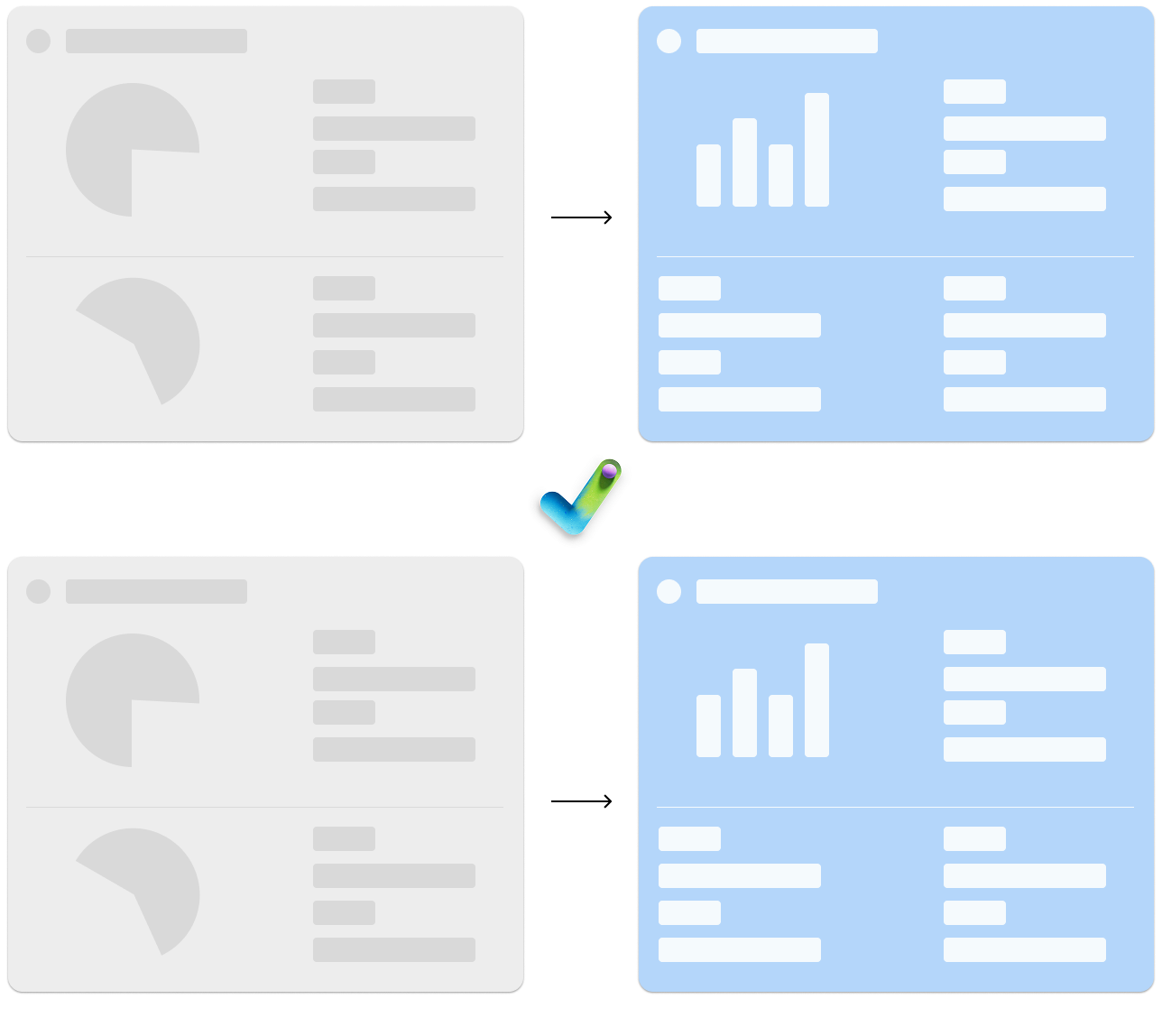
Previous version x 1st round of research
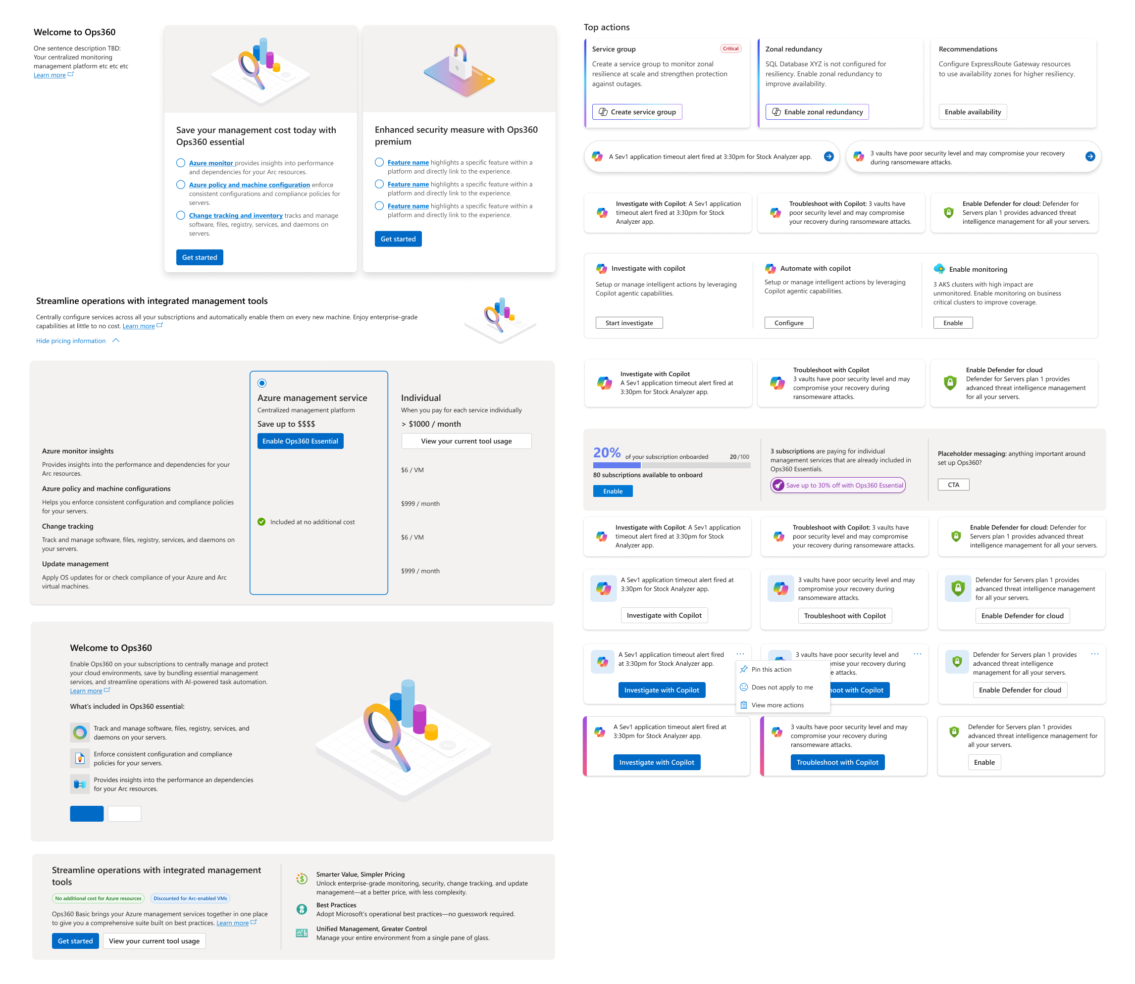
✅ Designed a comprehensive dashboard
🚫 Spotlight critical information
❓ Enable users to triage and act quickly
User verbatim
“As a global admin, I’d like to see everything at a high level, but I’m not going to dive deep into each cloud area. I'd prefer to view high-level insights through OPS 360”
Although it did help each team figure out what's most important for them to show, but once all the data gets populated, I realized this is not going to work. We did provided a comprehensive view, but by treating every data equally, there is no visual hierarchy, and failed my goals of wanting to help users spot the MOST critical information. Additionally, when everything is actionable on the page, nothing is!
I need to be very selective with what data deserves a data visualization which usually grab people's attention first, and what's need to be highlighted as critical in comparison to other information in the page.
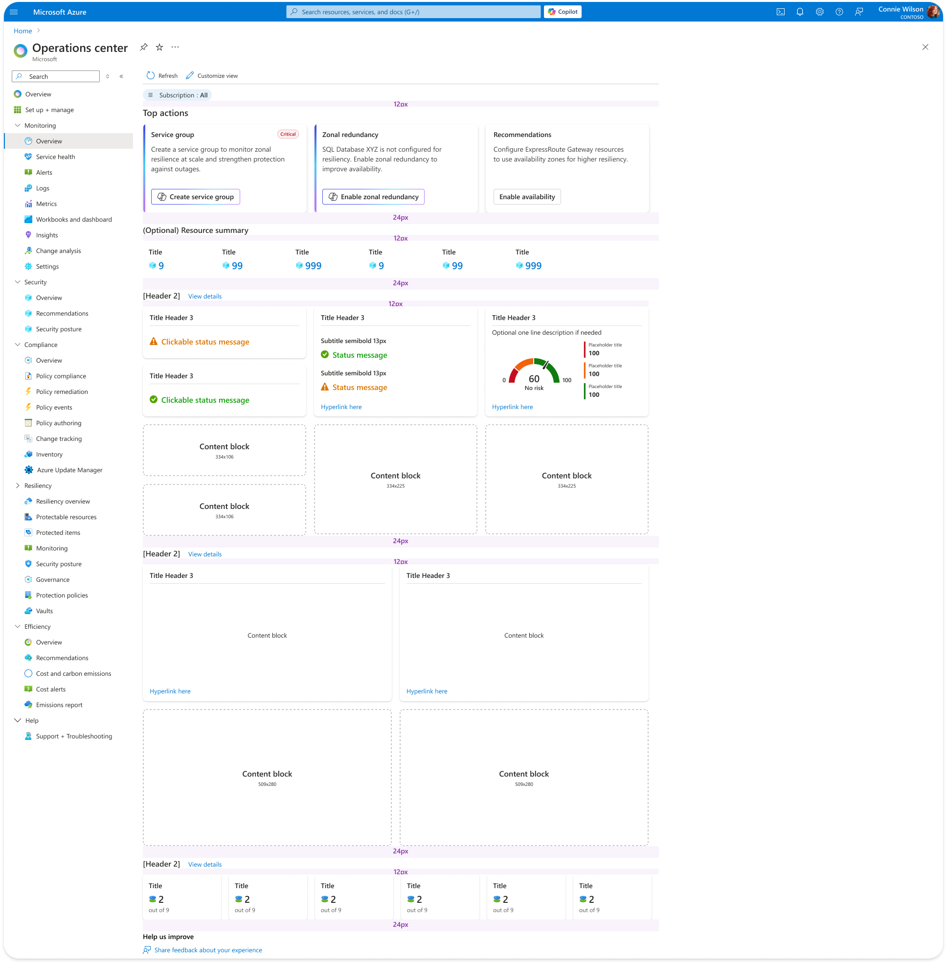
New version received positive feedback from customers
Based on the first round of research,
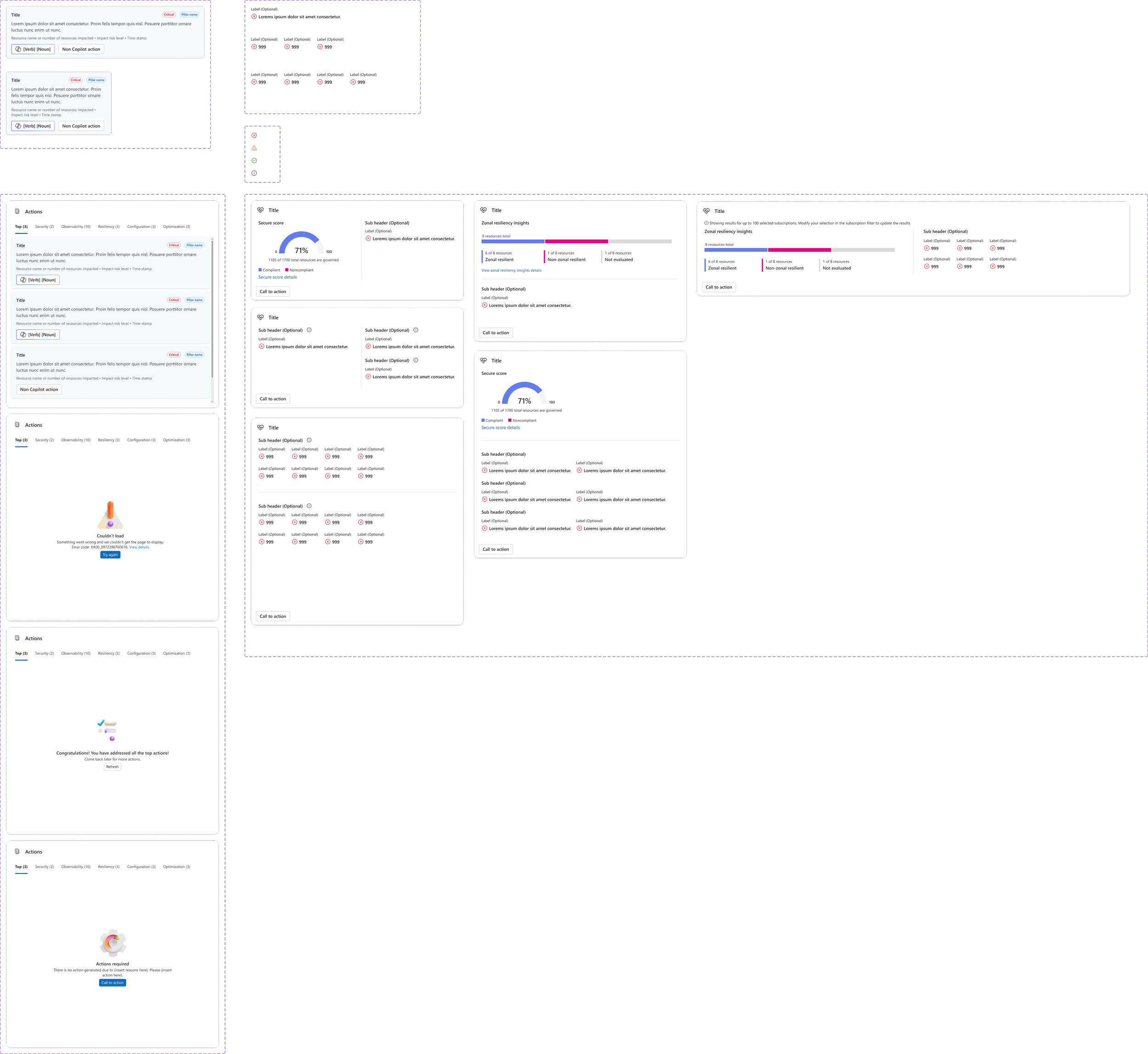
1. Adding visual cues for critical & actionable insights: We know that we provides most value to customers when we surface actions that's critical to them, so changing the design to a vertical modular design with critical tags, and tabs that can switch to a specific category.
2. Reduced clutter and alarms everywhere: Combing the top 3 data points per pillar helps us present information succinctly
3. Be very selective with data visualization: Since data charts always draw people’s attention first, I want to be very selective so it doesn’t become too overwhelming and cause abandonment. After many discussions, I hand picked 4 data types that are critical with “progress“ and “time“ which illustrate better with visualization than text.
Leading teams through implementation changes with design influence and compassion
Leveraged design influence and rallied between leadership and product teams to balance visual alignment while considering engineering costs and resource constraints in such a short time.
Guided 5+ product and engineering teams with side by side design walk through, and provided a middle ground with prioritized minimal changes that satify the visual alignment requirements, yet reduced rework.
Teams were able to deliver well balanced tier 2 data summary pages that are coherent with the newly updated tier 1 dashboard.
My design strategy & impact
#3 Applying system thinking and design to scale
System thinking and large scope communication
Challenge:
Though with the new design system requirements, a lot of patterns that fits Azure’s specific use cases were not yet developed.
Action:
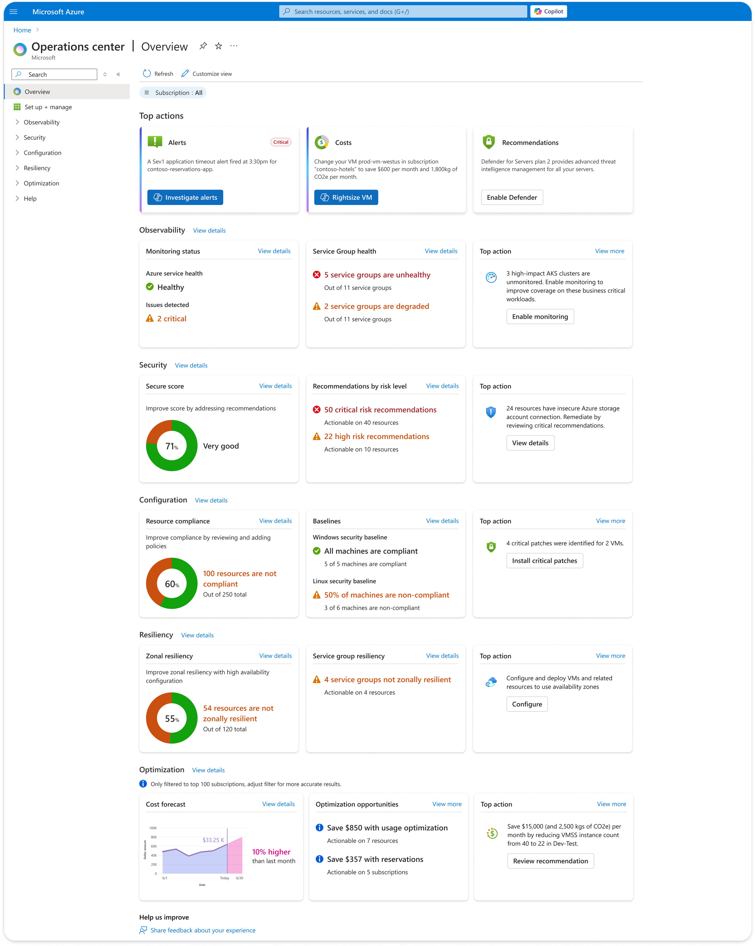
Took the lead to build out easy-to-use shareable components to facilitate cross design teams collaboration including the design system team, answering and resolving emerging pattern questions, including error, empty, and loading states, for 10+ designers.
Results:
Created the first agentic action card component that were quickly leveraged by 4 other product teams, and adopted by the Azure design system team to make into an official pattern.